April 14, 2016
How to Create Infographics
As time goes on, standing out online with content is getting harder and harder. Almost every brand out there has a blog featuring top 10 posts, ebooks, videos, and infographics. The key to creating content, though, is not in the variety, but in the quality. If your video is choppy, your ebook poorly written, or infographic too long, it becomes just another random piece floating around in the vast sea of content. I’m going to show you how to cut through the noise. In this post, we’re going to focus on winning at infographic creation and promotion. While there may not be a tried-and-true formula to make each project Reddit front-page material, appear in a Mashable post, and be shared by @garyvee, there are some definite similarities while looking at successful infographics that worth pointing out. To begin, let’s take a quick look at five popular projects that you’ve probably seen around the web:
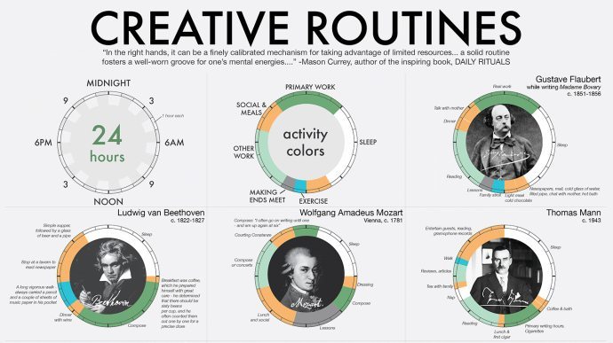
1. Creative Routines
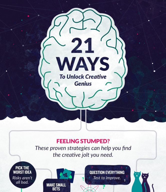
2. 21 Ways to Unlock Creative Genius
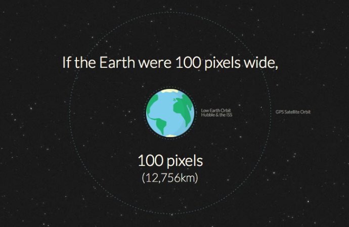
3. Distance to Mars
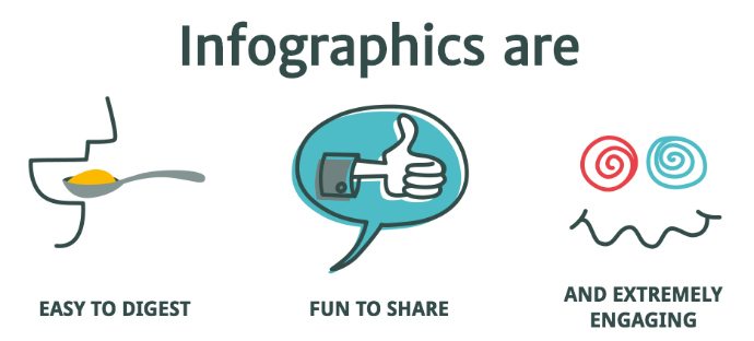
4. Why Your Brain Craves Infographics
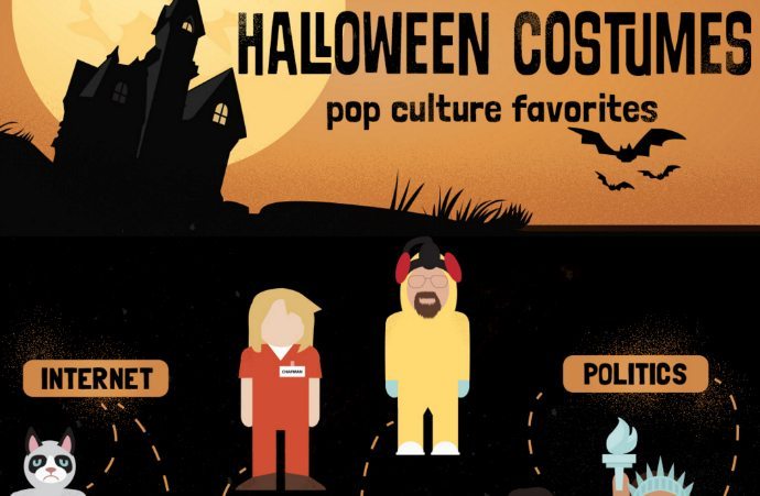
5. Halloween Costumes; Pop Culture Favorites
What these infographics have in common
While these graphics have different subject matter, audiences, style, and ways they’re delivered (static vs. interactive), here are the tips all five infographics follow.
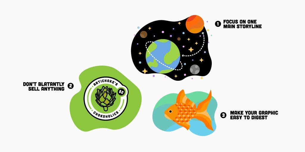
1. Focus on one main storyline
When looking at the above examples, you know exactly what information you’ll learn about at a glance. These pieces are engaging and skillfully lead you to the parts of the story you need to see. Focusing on the distance to Mars is much more engaging than spreading it out to everything in space. Having a broad subject line tends to be overwhelming for a reader. When it comes to creating your own infographic, start with the end goal in mind. Most people begin with finding an interesting idea to illustrate first, but defining your graphic’s goals and working back from there is even better. What do you want people to do after reading your infographic? If you can answer that question first, you’ll be a lot more focused when you start to brainstorm ideas than just making something you find interesting. Once you find a subject, it also helps to find an interesting angle to your story rather than just recirculating random fun facts about said topic.
2. Don’t blatantly sell anything
People share things because they want to be a thought leader in their industry, because they want to seem cooler or smarter than their followers, or because they genuinely enjoyed the subject matter posted and think their followers will, too. People don’t share sales collateral just because it’s disguised as an infographic. People won’t share your visual press release with their pals because they care so deeply about your new and improved product offerings and how they differ with your competitors. Make an infographic that isn’t incredibly branded, contains helpful and useful info for readers, and only features your logo subtly and once, and it’s much more apt to be shared by your audience.
3. Make your graphic easy to digest
While I’ve definitely seen graphics being retweeted that are incredibly crowded, possess no hierarchy, feature 4,000 different fonts, and run about a million pixels long, let’s all do ourselves a favor and stop creating those monstrosities. The five pieces above do a great job at being concise, featuring easy-to-navigate layouts, and are designed well. They use a consistent color palette, a limited amount of fonts, a small amount of text, and visuals that enhance the ideas in text rather than distract from them. Remember, a human’s attention spans is now shorter than a goldfish, so keeping it short and simple is key in today’s world. When creating your own infographic, limit your storyline or amount of data to a maximum of one and a half pages of text. Keep your ideas simple, and your piece will be more attractive to the reader.
How to promote your infographic successfully
Sometimes, it’s the luck of the draw. The right person will see your infographic, retweet it, and popularity ensues. 99% of the time though, that’s not how success works. To get your project featured on several popular blogs and retweeted 8,520 times, there’s some prep time involved after the infographic has been designed. In the words of Neil Patel at QuickSprout, “Unless you have the following of Lady Gaga or Justin Bieber, a couple of tweets, an email or a blog post are not going to do the trick.” Here are a few tips on what you need to spend your time on:
1. Research your audience and find out who influences them
You may know who your audience is, but did you think about how you’ll reach them? The first step is to figure out who they follow online and what blogs they check out daily. This is definitely a spreadsheet type of a deal. Once you start seeing the accounts that your target audience is following, you’ll need a place to start organizing the info, emails, and Twitter handles of all of the people you’ll be reaching out to. This also helps you keep track of who you’ve reached out to, and is a good place to store their responses and any notes you have about your interactions with those people. BuzzSumo is a helpful tool for finding influencers. You can search for bloggers, influencers, companies, journalists, and regular people to be your promoters. 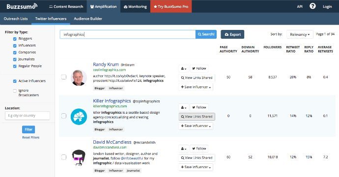 If you plan on creating multiple pieces of content surrounding your topic, it’s wise to establish relationships with your industry influencers before you ask them to share your work. Emailing them to mention that you’ll have some upcoming pieces of content that’ll be helpful to their audience can help spark a conversation long before you’re demanding a share. For more individual tactics on infographic promotion, this QuickSprout article has some great tips.
2. Tailor your promotion approach for each social channel
The hard part about sharing infographics on social media is that besides Pinterest, other social media channels don’t show them off too well in their entirety. When posting a full jpeg of the infographic on Facebook or Twitter, it usually becomes impossible to read. See? 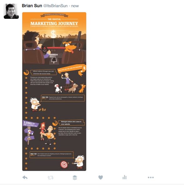 When promoting your infographic on social media, it’s helpful to either have your designer make small pieces of content that feature the header and title of the graphic to tease readers (also known as microcontent), or even just screenshotting a visually compelling section of the infographic to help tease readers with a stat or two from your piece as well. For example, using the carousel post-type in Facebook with three different sections of your graphic is another great way to at least get the gist of your graphic across to busy readers and entice them to click through to see the full piece.
 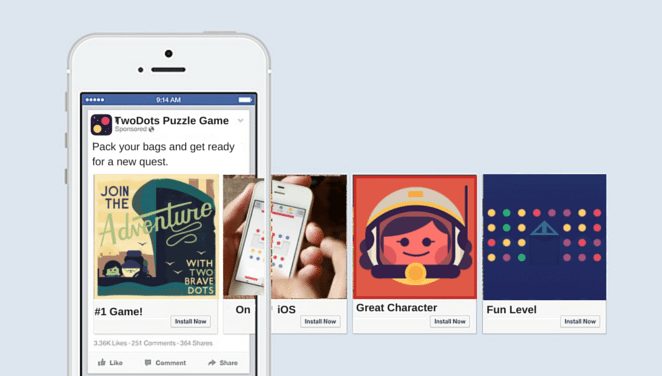 In short, experiment with what works best on your channels and remember that what works on Twitter won’t necessarily translate to Facebook. With social media channels ever-evolving and becoming increasingly more visual as time goes on, it’s becoming easier to share visual pieces than even a couple of years ago, but infographics in their natural form are still a bit of a challenge. If you’re interested on more tactics and ideas on how we share infographics across your social media channels, check out my thoughts in this blog post and infographic.
3. Don’t forget to re-share
If your infographic is a bit more evergreen and not event-based, this is key. Many people forget to reuse their content, but we’ve seen success with reposting infographics at different times of the day, different days of the week, and even different times of the year (especially on Twitter). Sharing your piece of content on your social channels multiple times will:
- Reach followers in different timezones
- Reach new followers since the last time you shared
- Increase traffic on your blog
For more tips on how to re-share your content successfully, I highly suggest reading and following the steps in this Buffer blog post. Have you created and shared any infographics for your brand? What insights have you gained from your own experience? Share in the comments.


