January 19, 2017
Newsletter Best Practices
Email newsletters are a staple for any marketing strategy because they provide an avenue for building an ongoing relationship with your audience—and growing sales. Over the last year, we’ve been busy experimenting with our monthly email newsletter. This post sums up what we found works (and doesn’t work) in hopes that our takeaways will inspire newsletter testing, optimization, and improvements of your own. A few disclaimers before we move forward:
- Newsletter results will vary widely depending on your company, your audience, and your content. What works for Autopilot may not work for you. We highly recommend conducting your own experiments to see what works best for your context!
- To keep tests clean, we tested one element at a time and kept the rest of the email identical between variations. Following Lars Lofgren’s rules of effective experimentation, we ditched the variant and stuck with the control if the test was inconclusive. If we found a winner, we used that variation moving forward.
- Unsurprisingly, about half of our A/B tests were inconclusive—meaning they did not reach 95% statistical significance. This is actually better than failure rates others have cited. Point being, don’t get frustrated if your tests aren’t delivering meaningful results. You’ll still learn from these and will run more successful tests with time and practice. Here’s a free significance test calculator from Kissmetrics in case you’re hunting for a good one.
Now read on to see what we learned after 12 months of A/B testing email newsletters.
1. People want to hear from people
Sending newsletters from a real person has an impact. In our case, we send from Guy Marion, CMO & Head of Growth at Autopilot. We conducted two experiments comparing open rates for different sender names. The first tested a specific person’s name versus a general company sender: [Variation A] Guy Marion [Variation B] Your mates at Autopilot The email sent directly from Guy converted 12% better! This is consistent with other tests we’ve seen in the industry. In most cases, you’ll get better results by sending an email from someone who people will grow to recognize and build a relationship with via their inbox. After receiving feedback that people wanted a clearer way to identify our newsletter as Autopilot’s, we tried testing sender name again. [Variation A] Guy Marion [Variation B] Guy from Autopilot This time the test turned out to be inconclusive, with only 86% certainty that Variation A would convert better than Variation B. Because this test wasn’t statistically significant, we’ll be sticking with the control for now. Our conclusion? While using your company name is a more obvious way to show who the email is from, it is a less personal approach, making it easier to skip over or delete without opening.
2. Get to the point
Don’t make people scroll too long before delivering something of value. That’s what we learned when we tested a large newsletter header against a condensed one. 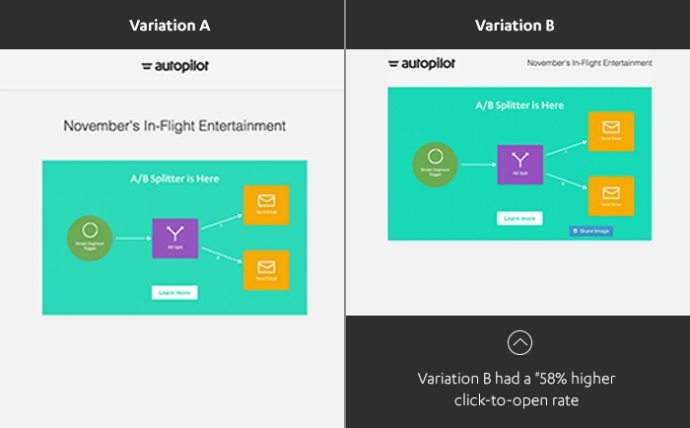 The results proved our assumption that the large newsletter header was taking up too much real estate. Because we wanted to compare actions taken after the open, the core metric we considered for this test was click-to-open rate (clicks/opens) as opposed to click rate (clicks/deliveries). With 100% statistical significance, the condensed header converted 58% better than the large header.
3. Send it on a Tuesday and in the morning
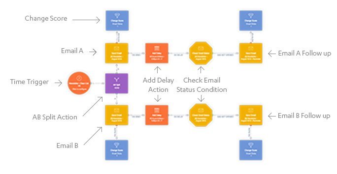
Maintaining a regular email newsletter sending schedule is a good thing, not just for you but for your readers too. They’ll know what to expect from your end, and you’ll give yourself a hard deadline to meet. In fact, companies who stay in touch at least every 2-4 weeks generate twice as many leads as those who don’t. So we send one newsletter per month, but what about day of the week and time of day? Let’s start with day of the week. Our newsletter journey is modified from the email newsletter with a 48-hour follow-up journey found in Autopilot’s Guide Book. This templatized guide re-sends a copy of your newsletter 48 hours later to contacts who did not open the first email, with a small modification to the subject line (e.g. “Reminder: [Original Subject Line]”). We’ve found this second send increases email open rates every single time without noticeably impacting unsubscribe rates. Here’s what our typical newsletter journey looks like, which includes an A/B Split action, Change Score action, and 48-hour delay step:
Comparing email open rates, tests showed our audience responds 18% better to newsletters sent on a Tuesday (with the 48-hour follow-up on Thursday) versus Wednesday or Friday. In terms of time of day, we found our sweet spot is 8 AM PST. Because our founders are three Aussie brothers, we have a large and active community rooted in Australia and New Zealand. We hypothesized that a later send time, like 2 PM PST, might fare better for our audience across the globe, meaning our newsletter would hit AEDT inboxes at 9 AM instead of 3 AM. However, with 100% certainty, the control 8 AM PST send time saw 24% higher open rates compared to 2 PM PST. Of course, there is plenty more testing we could do here. In the future, we’ll experiment with personalizing newsletter send times and content by segmenting our audience based on location and topics of interest.
4. GIFs are fun, but the jury’s still out on whether they convert
GIFs have been explosive in marketing and it’s easy to understand why. There’s something about watching a few frames repeating endlessly that mesmerizes and appeals to people more than a still a picture of the same thing. Look at this cat stuck in a flip flop, for example:  But do these animated image formats make a difference in your performance? To put it to the test, we tried an A/B split of one variation of our newsletter with all static images and another with GIF images interspersed throughout to see which had a higher click through rate. Here are some of the static and GIF images we tried, side-by-side:

 The results were… inconclusive. Sadly, we didn’t find that GIF images wildly improved our click rates. If anything, there was a leaning towards static, with still images converting 17% better than GIFs at 93% statistical significance.
5. Microcopy makes a macro difference
Most marketers A/B test the needle movers—CTA buttons, subject lines, layouts. But sometimes tweaking the small stuff, like microcopy, can influence behavior in a big way. What’s microcopy? These are the bits of copy that help improve the experience by instructing people on what action to take next. A classic example of microcopy is Facebook’s status update line. Can you imagine the difference if they didn’t ask, “What’s on your mind?”  For our newsletter, we wondered if we were missing out on clicks by not including a text call-to-action link below our feature image.
 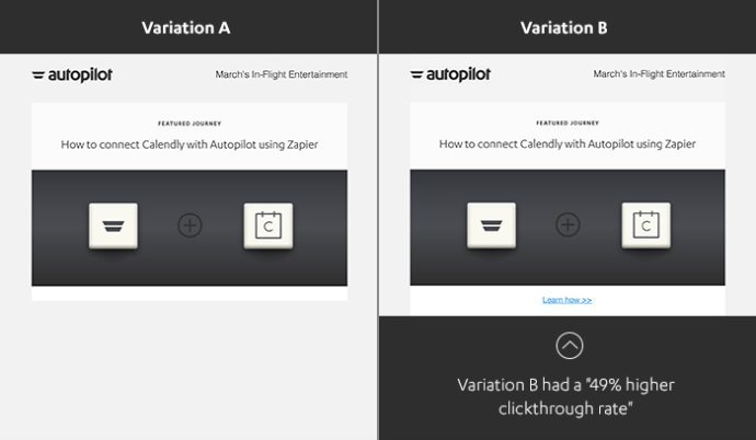 The variation which included a Learn how >> link converted 49% better than the newsletter without it! From this test, we are 99% certain that adding a link below the feature image will improve email click rates.
6. Two-column newsletters are easier to digest, but single-column ones get more clicks
One or two columns? It’s one of the great marketing debates. You have your classic two-column newsletter lovers, who tout the scannability benefits of a more compact view. Not only can you pack in more content using less space, but there are more opportunities to showcase that content above the inbox fold. On the other hand, single-column newsletters are more easily responsive to screen sizes, an increasingly critical factor in our device-filled world. Single-column layouts are flexible, attractive and have a lower chance of breaking—regardless of whether you choose to include three sections or ten. We wanted to be sure of this, so we tested it a whopping three times using different variations of audience segmentation. Here’s an example of the layouts, side-by-side:  The results consistently showed the single-column variation as the winner when comparing click-to-open rates:
- Test 1: Single-column variation converted 30.62% better than two-column variation at 98.6% statistical significance.
- Test 2: Single-column variation converted 44.26% better than two-column variation at 98.09% statistical significance.
- Test 3: Single-column variation converted 22.12% better than two-column variation at 93.79% statistical significance.
Granted, these are surface-level metrics. What’s more revealing is analyzing which links were being clicked for each variation. We noticed the two-column newsletters had fewer clicks overall, but the distribution of the clicks were more evenly spread, despite the order of content. Things on the bottom-left corner were getting clicked just as often as those on the first row. While the single-column variation had higher click volumes, these were all concentrated on the first few sections. Links all the way at the bottom weren’t getting as much love.
Introducing Autopilot’s new-and-improved newsletter
With these tests behind us and the wisdom we’ve gleaned so far, we’ve armed ourselves with a shiny new newsletter template and a fat list of experiments to try in 2017. This new template is a hybrid of our past learnings from customer feedback, data, and the direction we want to take our brand in the coming year. Here’s a sneak peek: 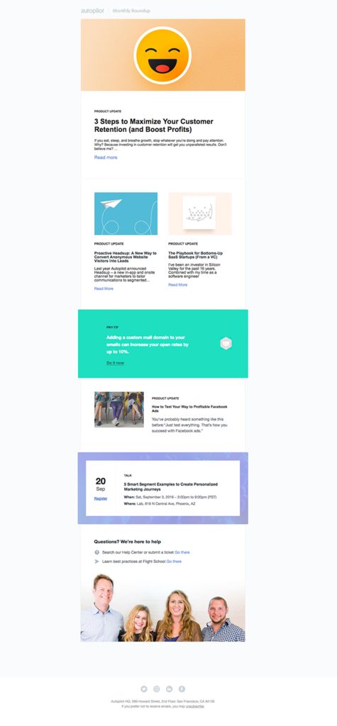 Would you like to receive Autopilot’s monthly newsletter? Subscribe here if you’re interested in hearing about remarkable customer journeys, new features, automation tips, growth events, and how you can successfully take your marketing on Autopilot. What do you think we should test next? What discoveries have you made while A/B testing your own email newsletters? Please share with us in the comments.


 (
(


