June 16, 2016
Permission Marketing
It’s rare that you visit a blog these days without encountering email opt-in forms, which come in a variety of flavors:
- Full-screen welcome mats** that blanket your whole screen asking you to opt-in for a lead magnet or email newsletter**
- Chat-like bubbles that are typically displayed on the bottom right-hand corner of your screen, and look similar to phone notifications
- Exit-intent popups that stop you in your tracks right as you’re about leave a website, and try to reel you in with an offer
- Header or footer bars which are typically narrow bands that stick to the top or bottom of the page
The formats range from subtle to aggressive, with the common goal of a capturing a visitor’s email address to start a long-term relationship between company and consumer. But the different approaches are divisive, to say the least. A recent thread on inbound.org unearthed a variety of opinions about how to use email opt-in forms. Some marketers consider them a necessary evil, some are ardently against using them to begin with, and others are all for it with the caveat that they’re deployed with care and consideration. Which approach is the best? It depends. Let’s dive into the different factors to consider.
The data (and the tools)
We’ll be covering three email opt-in tools in this post: SumoMe’s Welcome Mat, Autopilot’s Proactive Headsup, and ThriveLeads’ list building plugin for Wordpress. 1. SumoMe Welcome Mat is a full-screen overlay that shows up when a person visits a website. Here’s an example: 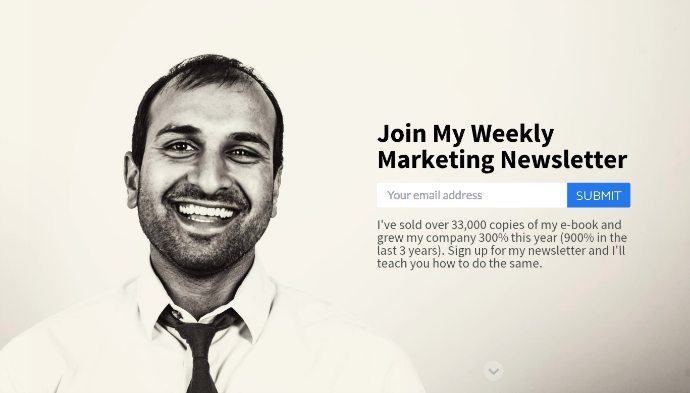 To make the overlay go away and get to the rest of the website, you can either a) opt-in or b) scroll down. The data points:
- Welcome Mat has a 1.76% average opt-in rate. However, the top 10% of websites using the tool see conversion rates of nearly 7% and the top 25% of website see an average conversion rate of 3.67%
- Marketer Sujan Patel (the guy in the above example), cites a 1.8% to 2.3% conversion rate for Welcome Mat, and says he’s had that performance for 3-4 months. He lays out his results in this thread.
2. Autopilot’s Proactive Headsup is a notification-like talk bubble that displays on the bottom right corner of a web page, and shows to anonymous visitors. It looks like this: 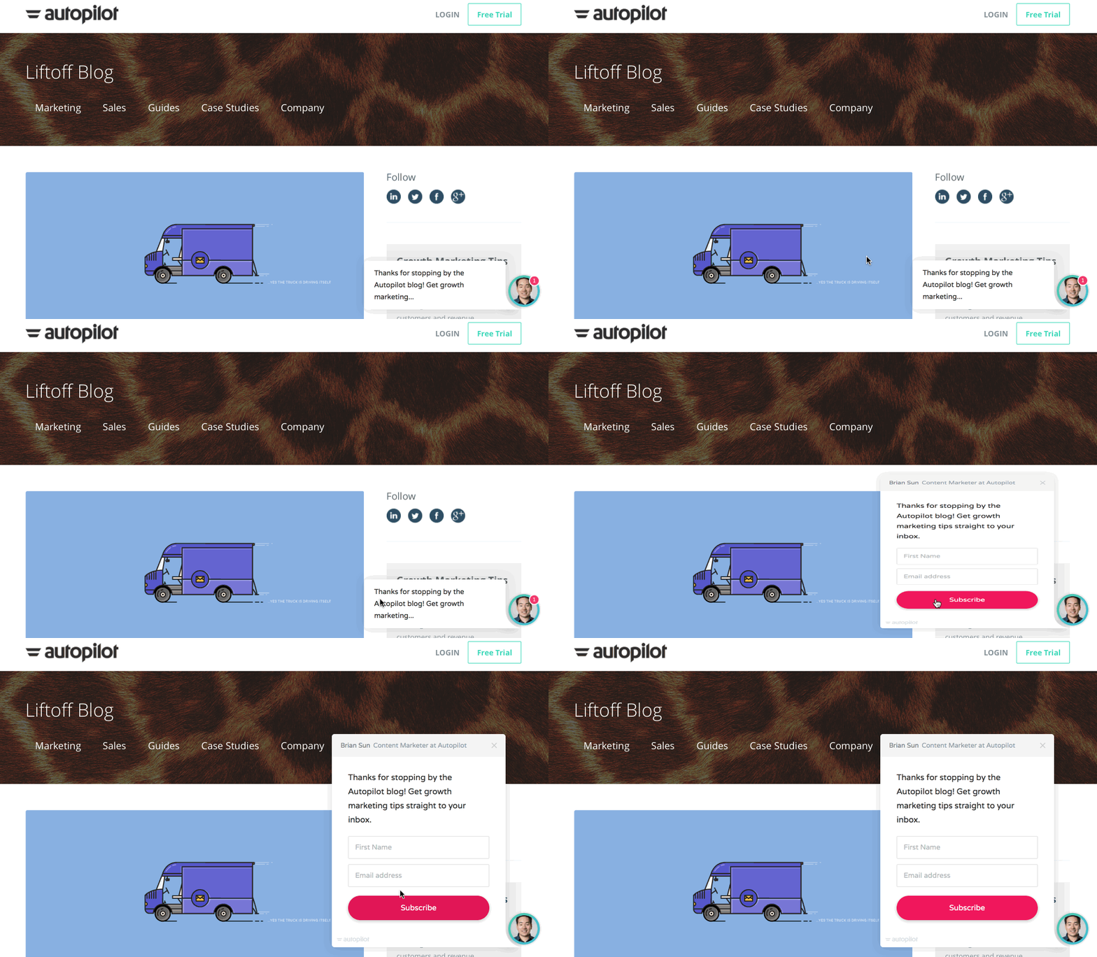 It can function as an email opt-in or call to action that encourages visitors to check out another relevant page, such as a product updates page or webinar invitation page. The data points:
- Accountex captured 30 new leads within a few days after implementation
- u-blox generated 60 new leads in the first 48 hours after deploying
- Delta Cycle acquired 28 new leads in their first week of using Proactive Headsup
This tool is fairly new (introduced in May), so data is limited but early results show they are effective for acquiring signups quickly. 3. ThriveLeads is a popular list building plugin exclusive to Wordpress users. It offers a variety of formats like lightboxes, widgets, and overlays. Here’s an example: 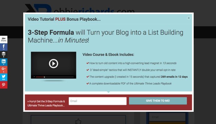 The email opt-ins are shown based on triggers like time elapsed, a percentage of page scrolled, and click or exit intent. The data points:
- John Lee Dumas of Entrepreneur On Fire used the ThriveLeads opt-in form to gain a 238% increase in conversions on his website.
- Robbie Richards logged a conversion rate of 5.45% with ThriveLeads’ opt-in forms.
Marketers have seen conversions from using all three tools. But is that the only factor to consider? Nope. You also have to think through the user experience.
What user experience is your email opt-in form creating?
As mentioned above, there’s a spectrum of subtle to aggressive when displaying email opt-in forms. If you’re too subtle, you may miss out on potential leads who become customers. If you’re too aggressive, you may leave a sour taste in the mouth of the 97% of people who don’t opt-in, even if the aggressive approach brings in 1% more subscribers.
 (Source)
Take this popup lightbox for example: 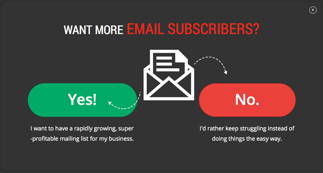 The “No” option includes copy that says “I’d rather keep struggling instead of doing things the easy way.” In reality, this is a biased question written to force people to make a choice and choose the obvious answer. Of course, everyone prefers doing things the easy way over a struggle. As a marketer myself, I understand copy like this is written to increase opt-ins, but what is the long-term value of guilting or shaming people into doing so? What kind of customers do tactics like this attract (or defer)? We have to take a step back and thoughtfully consider if the way we’re approaching email opt-in forms both a) maximizes the conversion rate of visitors to emails captured and b) minimizes any negative impact on the experience for all visitors. Here are the three core components to think through:
Component #1: The Presentation
The size, style, and behavior of your form is important. Do you want it to take up the whole screen like the Welcome Mat? Or be more subtle like Autopilot’s Proactive Headsup? Perhaps it’s best to show your form after the reader scrolls 60% of the way down the page? Decide how forward you want to be with asking for the opt-in. Equally important is the look and feel of the offer. Use imagery to complement your form’s copy, and to show the tangible piece of content your reader receives in exchange for opting in, like this example from Sales Hacker: 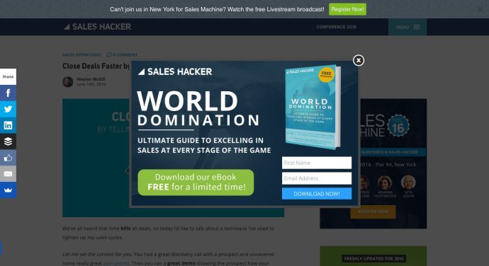 This email opt-in form is visually appealing with sophisticated typography, on-brand colors and imagery, and a clean look and feel. The book cover image itself does a fantastic job of showing the visitor exactly what they’re going to receive in exchange for sharing their name and email, and it even looks like a cover you’d find on the latest bestseller list. Sales Hacker’s focus on presentation subconsciously increases the perceived value of their offer, which encourages opt-ins.
Component #2: The Offer
The offer is the asset the reader receives in exchange for handing over their email address. The asset is typically an ebook, checklist, or template, but it could be anything – a webinar, a free jam session, a t-shirt – as long as it’s compelling enough for people to subscribe. Check out these ten lead magnet examples for more inspiration. Here’s a great example from Simple Green Smoothies, a community committed to healthy living: 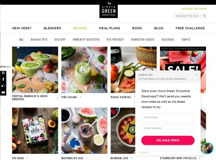 The company draw visitors in with fun on-brand copy, weekly “love notes,” the latest recipes, and a standout call to action that says “Oh, Kale Yeah!” Like Simple Green Smoothies, write compelling copy that sells the visitor on the value of your lead magnet. Your headline, offer, and call to action all have an impact on the success (and user experience) of your opt-in form.
Component #3: The Promise
What are you going to do with the email address? That’s your promise. Some opt-in forms are vague but well-intentioned (“We’ll never sell your email address or spam you.”), while others completely neglect to communicate what happens next. The best ones relieve concerns over being spammed or harassed while conveying the value of the ongoing dialogue. (“You’ll receive our weekly resource newsletter that’ll equip you with the knowledge you need to grow your widget business.”) Here’s a great example from Appcues: 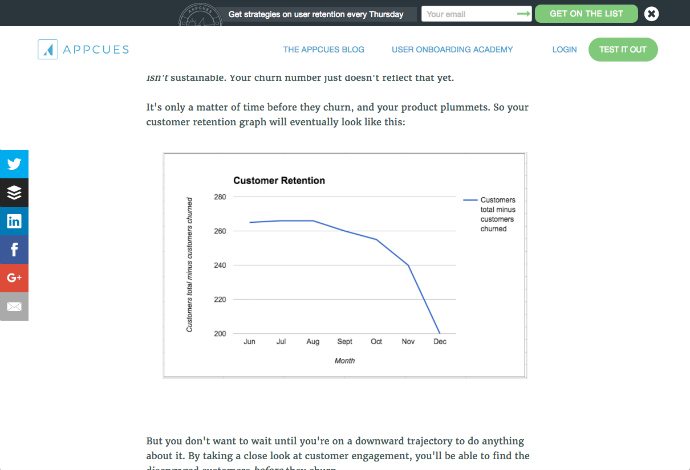 This sticky header bar very clearly communicates what you’ll get (user retention strategies) and how often (every Thursday). It’s short, sweet and to-the-point but the visitor gets immediate access to the opt-in’s offer and promise. Being upfront about what happens when a visitor opts in sends the message that your brand isn’t going to spam them with promotional campaigns. This helps ease the hesitancy that a visitor might experience in sharing their email with you.
Putting the pieces together
Whether you decide to implement an opt-in form on your website or choose to grow your email list in other ways, there are multiple variables to consider when crafting your opt-in forms. Choose the opt-in tool that fits with your approach (from subtle to aggressive), and pay careful attention to how you craft the presentation, offer, and promise so that opt-in or not, you’re still providing a great experience for your visitors. Where do you stand in the great email opt-in form debate? What are you doing to maximize conversion without hindering the overall visitor experience? Let us know in the comments.


