October 29, 2015
Postcard Marketing
For a lot of people, the phrase “direct mail” conjures up images of 50% off coupons for vacuum cleanings. In short: junk mail. But when it’s done well, it works. Harvard Business Review says that response rates for direct mail are more than twice as high as email, display ads, and paid search. Turns out direct mail can be a great channel for engaging with potential customers. But what does a successful campaign look like? What kinds of offers attract more leads? In this post, we’ll look at six direct mail examples to spark ideas of your own. Keep your eye out for these best practices:
- Pictures that show people, product, or a mix of both
- Benefits-focused copy to show value and sell readers on the product or service
- Promotional offers to entice readers to make a purchase
- Unique promo codes or targeted landing pages to measure the return-on-investment of the campaign
1) Heal - Use imagery in their direct mail campaigns that makes people feel emotion.
This medical startup is like Uber for doctor visits. You request a doctor visit through a mobile app on demand or whenever is most convenient for you. Heal does a great job of using human, happy imagery, especially in the picture that makes you open up and say ahhhh. Their brand colors are also vibrant, lively, and fun. My guess is to squash any childhood I-hate-going-to-the-doctor memories. 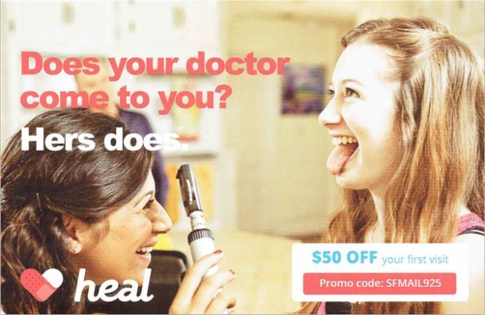 In the headline below that reads, “Does your doctor comes to you? His does” the company puts their core value proposition of convenience front and center. And the offer knocks half off the $99 price tag to reduce the friction of scheduling a first visit.
 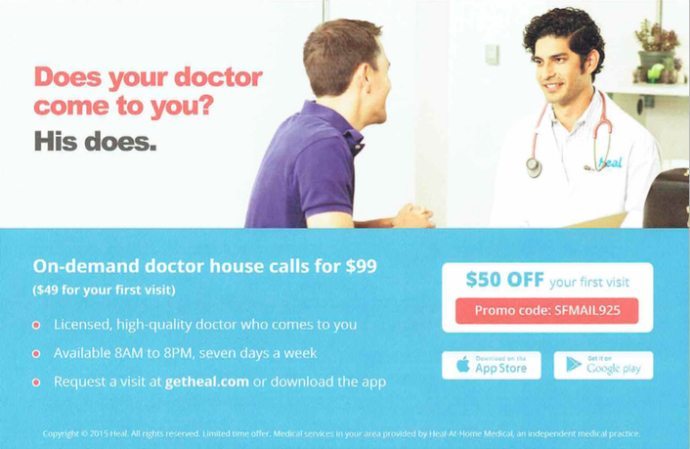 Takeaway: Use imagery that evokes an emotional response in your target audience, specifically by showing people smiling, feeling relieved, or having a great experience – or whatever it is you want them to feel.
2) Sprig - Reinforce your benefit statements
Like Heal, food startup Sprig uses powerful imagery. Doesn’t the phrase go something like, “a picture is worth a thousand drools?” Sprig is good at clear, focused benefit statements. The centerpiece on one side of the postcard is a mouthwatering image of steak and potatoes with the phrase, “Simple, organic, ready-to-eat meals in just 15 minutes” – something that sums up the company in one sentence. Most readers will understand their core value proposition immediately. 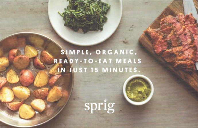 The other side of the postcard expands on all the juicy details. Their simple ordering process, fresh recipes, and delivery speed. One thing they could improve: The $15-off box visually stands out from the other copy, but lacks context without showing how much a typical meal costs, potentially leading to a this-discount-could-be-better feeling in potential customers.
 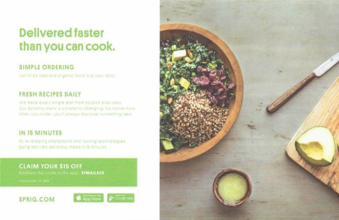 Takeaway: Make your core value proposition obvious. And like an irresistible menu description, lay out the specifics that entice people to order.
3) IfOnly - Link to a targeted landing page to measure results
Imagine taking a balloon expedition over Mt. Everest, sitting front row for a Stevie Wonder concert, or skiing with an olympic gold medalist. These are real experiences you can buy on IfOnly. They’ve done the upfront work of curating, planning, and talking to Joe Montana for you. On one side, IfOnly leads with the value proposition of “Make every weekend count” and a picture of the wine director at high-end restaurant in San Francisco. She’s smiling, of course. The headline leaves a little bit of mystery as to how exactly IfOnly is going to help make every weekend count. That’s on the other side.  Targeted specifically at San Francisco residents, the copy on this side speaks to local experiences in the Bay Area. I’ve been to Tomales Bay but never with an oyster expert. Have I had a Kara’s cupcake? Yep, but it’d be better to actually bake them with Kara. This is targeted, relevant, attractive copy. The call-to-action to “Redeem at IfOnly.com/SFoffer” is prominent. By setting up a specific page linked to this offer, IfOnly can measure both the amount of traffic generated and the number of people who make a purchase. This is important because you’re not just trying to make cool-looking postcards for fun; the goal is to bring in more revenue than was spent on the campaign.
 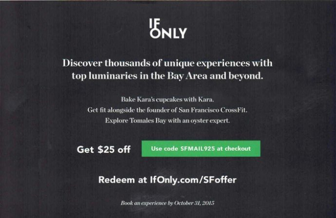 Takeaway: Link to a targeted landing page to measure traffic and use a coupon code to measure the number of new customers. To help you wade through the sea of options, check out these in-depth landing page builder reviews and comparisons.
4) Le Tote - Show how your product or service works
Coined as “endless fashion,” Le Tote delivers a box of clothes to your doorstep you can keep or swap out for new styles. On the direct mail postcard below, Le Tote shows a young woman getting a tote at her doorstep. The point? To help potential customers imagine themselves in her shoes. I’d even bet an arm and a leg she’s a target persona they created before ever sending a single campaign. 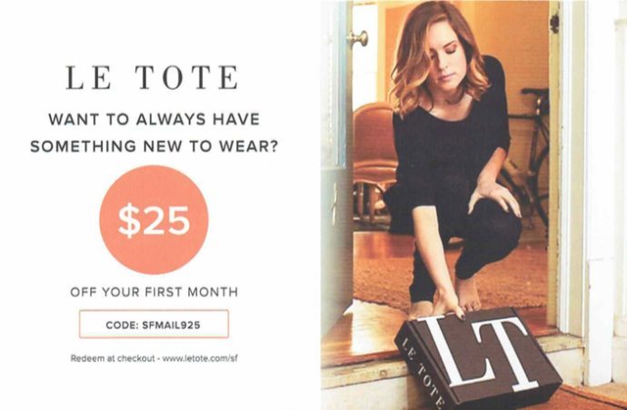 The how it works section takes up half of this side and the majority of the copy. This makes sense. Le Tote’s service isn’t as self-explanatory as Sprig and Heal. And the icons next to each step are a fun complement to keep the section from getting too text heavy. I appreciate the brand mentions on the right. My hunch is their target persona recognizes some or all of these brands.
 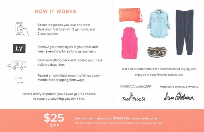 **Takeaway: **Include a how it works section if your service or product isn’t easily understood. This’ll increase the “I get it” factor for potential customers and draws in more leads.
5) Washio - Include a picture of your target market
Another company in the Uber of _______ genre, Washio is on demand dry cleaning and laundry targeted at major cities like Boston and Chicago. Washio shows people getting their delivery at home, just like Le Tote. By the way, are you beginning to notice the people-centric imagery theme in these direct mail examples? 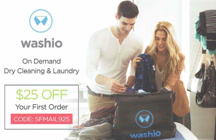 The other side is fairly text heavy, taking a features and benefits-based approach to explaining their service. “Clean clothes at the tap of a button” is more “Here’s what you get,” while lines like “Always available” are more, “Here’s what it is.” Kudos to their marketing team on their one-sentence value proposition and on-point explanatory copy.
 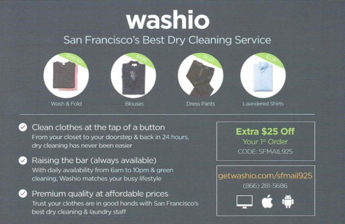 Takeaway: Include an image of your target market on your direct mail postcard to help potential customers picture themselves using your product or service.
6) SpotHero - Put your product front and center
City life is full of pros and cons. Big con: finding parking. SpotHero tries to solve this problem by helping people find discounted parking close to where they’re going. SpotHero is in over a dozen cities, but this direct mail postcard specifically targets San Francisco residents. They took a visual approach with icons to represent parking spots all around the city. The Golden Gate Bridge is in there for an extra dose of personalized marketing. 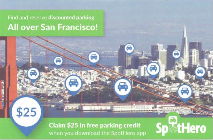 The two screenshots do a solid job of showing the product, not just talking about it. The right side features the 1-2-3 of how it works and another $25 offer with a promo code. Short, sweet, and to-the-point.
 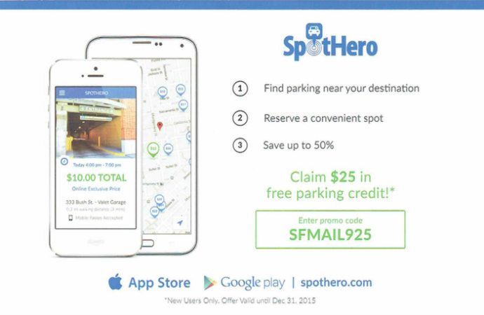 Takeaway: Put your product front and center, especially if you’re a mobile app business for Android and iPhone.
Common threads
The common threads throughout the direct mail examples are evocative imagery, great copy, attractive offers, and a way to measure return on investment. None of these techniques are a huge secret. They are more like a proven recipe to run an effective direct mail campaign for your business.