May 18, 2016
Transactional Marketing Automation
_Today’s guest post is from_ Kurt Diver, an Enterprise Email Deliverability Analyst at SendGrid, where he specializes in deliverability and compliance. His primary goal is to keep SendGrid’s email traffic clean by helping clients improve their email practices. Transactional email is “any message in which the primary purpose facilitates an already agreed-upon transaction or updates a customer about an ongoing transaction,” according to the Federal Trade Commission. Put simply, it’s an automated email that is sent after a transaction. Examples include…
- Order confirmations
- Delivery notifications
- Password resets
- “We’ve received your support request” messages
- Email address confirmations.
Because transactional emails function as a way to close the loop on a process someone has already started with you, people expect and often look forward to these emails. Imagine if the e-commerce shop you just bought sneakers from never sent you an order confirmation. What goes through your mind? Questions like “Did my order go through?” and “Am I going to get my sneakers?!” These touchpoints are an opportunity for marketers to build credibility, give customers peace of mind, and ultimately improve the customer experience. In this post, you’ll learn six transactional email best practices. You’ll also notice some overlap with traditional marketing email and while the line between the two can seem blurry, transactional emails have their own purpose and constraints which we’ll address throughout. Let’s dive in.
1. Write a straightforward subject line
Transactional email in subject lines are meant to inform, not sell. Since a transaction has already occurred, your goal is to communicate the brunt of the message even if the person doesn’t open the email. Here are some examples from a variety of companies:
- Your ride with Daniel on December 4
- Your Thursday morning trip with Uber
- Trip confirmed - 2008 Ford Escape
- Soothe Booking Receipt
- Your iwantmyname account information
- Amazon.com order of Startup Growth Engines
- Receipt from Philz Coffee Inc.
Notice any similarities? All of the examples are to-the-point, matter-of-fact, informational, and even a little…boring. This is the trend for most transactional emails, but you can also add a little brand personality without treading into marketing email territory. Try something fun like “Huzzah! We received your order!” or “Your package is en route.”
2. Provide personalized, clear details
Transactional emails are about communicating the details. Remember to include all the information specific and relevant to the individual recipient. This looks a little different depending on the email, so let’s look at an example to illustrate.
Shipping confirmation
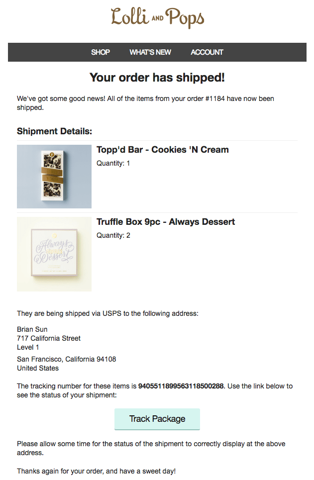 This shipping confirmation is from Lolli and Pops, a company that makes delicious chocolate. The email includes tons of relevant details…
- “Your order has shipped”
- Products ordered, including the quantity
- Shipping address (in case I made a mistake)
- Pictures to whet my appetite
- Order number I can refer to if I have to call their customer support
- Tracking number to hunt down my chocolate in the postal system
The email would’ve been a let down if it just said “Hey, your thing was shipped” and included nothing else. Whether it’s a shipping confirmation or a password reset email, shoot for thorough content covering every detail the recipient would want to know.
3. Don’t botch the sender name
Who the email is from can be just as important as _what _the email is about. The “From” name, or sender name, can add an extra sense of assurance that the email is coming from the right company and/or person. Here’s an example of what not to do:  The sender name is “cs” in the above example. But…who is “cs”? Charlie Sheen? Cool Sloth? Or did they just misspell CSS? The recipient is left guessing. Instead, use a sender name that’s easily recognizable, like this example:
  The sender is “BuzzSumo Alerts.” No mystery, no confusion. Just clarity.
4. Design an on-brand email template
Transactional emails are a regular touchpoint in your customer’s experience, so give their email template designs some love. One study even found that open rates can be three times higher than marketing email. Translation? Your designs will get seen by people. Lots of people. Lyft does a great job creating on-brand transactional emails with its ride receipt: 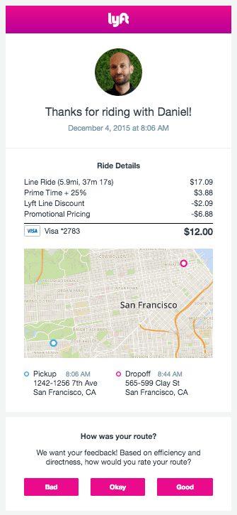 The company uses its signature pink color on the header, buttons, and smaller design elements like the “Dropoff” icon. You can’t miss the logo at the top either, because it’s front and center. The email is distinctly Lyft. In contrast, check out Uber’s ride receipt:
 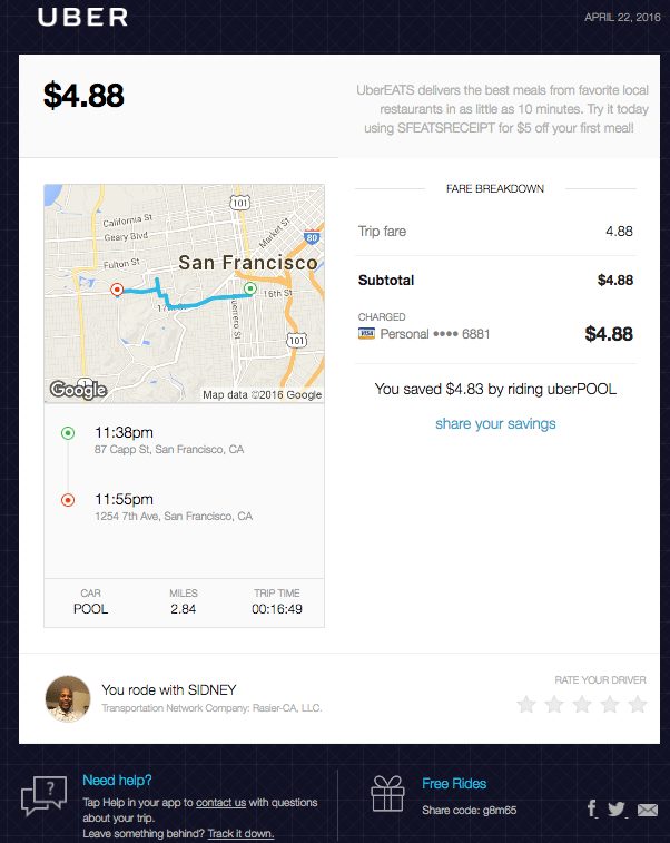 This was before Uber Dribbbled up its new logo. There’s similar information included in Lyft’s and Uber’s emails (fare, map, trip time, driver, etc) but the designs are completely different. The dark color palette and blueprint-like background contrast with Lyft’s lighter feel, and the layout has two columns instead of one. The takeaway here is to copy their emails…just kidding. The takeaway is designify your transactional emails to fit with your unique brand.
5. Craft a digestible message
As hinted above, transactional emails are not marketing emails. We (SendGrid) pointed out in our Marketing Versus Transactional Email Guide: “Despite your ability to add marketing messages to transactional mail, you must remain focused on the primary purpose of the email. The general rule of thumb is that marketing messages take up no more than one-third of the transactional email.” In other words, make your message about the transaction. And ideally, make the message digestible, kind of like how you would structure a blog post for skimmers. Shyp has one of the more digestible transactional emails I’ve come across. It’s the company’s shipping notification: 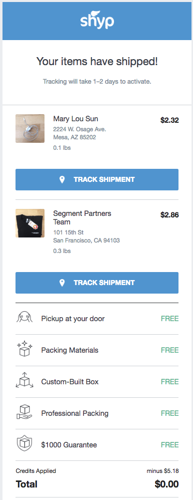 The messaging is super simple: “Your items have shipped!” The breakdown of pickup, packing, and the $1000 guarantee is easy to scan because the copy is short and my eyes are drawn to “free” (but whose isn’t?). Also, the item recap is super clear with the images and the hard-to-miss “track shipment” buttons. Definitely a quality transactional email.
6. Include your company mailing address
This best practice is fairly straightforward. Include your company mailing address in every transactional email. As we’ve mentioned on the SendGrid website, “while you are not required to include your physical mailing address in transactional messages, it won’t hurt your deliverability and it shows your accountability to your brand.” Check out how OpenTable does it in the footer of its reservation confirmation email: 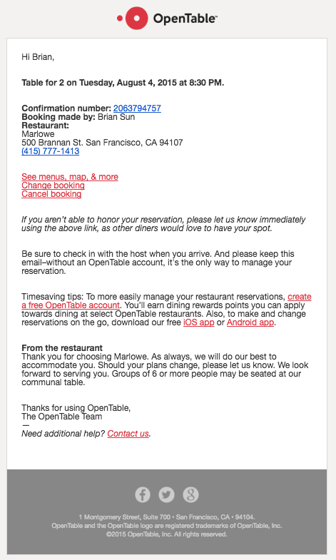 Odds are your transactional email provider will have a setting to add your mailing address to the footer across all your emails, so you don’t have to do it manually every time. To recap, the transactional email best practices to follow are:
- Write a straightforward subject line
- Provide personalized, clear details
- Don’t botch the sender name
- Design an on-brand email template
- Craft a digestible message
- Include your physical mailing address
By following these practices, you’ll be on your way to creating transactional emails that promote your brand and enhance the customer experience. Are there any best practices you’d add to the above list? What are some of the best practices transactional emails you’ve seen? Let us know in the comments.


