September 21, 2015
Writing for the Web
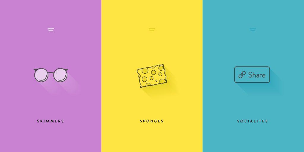
The web has changed the way people read. According to Physicist Hugh Pickens, “Before the Internet, the brain read mostly in linear ways — one page led to the next page, and so on. The Internet is different. With so much information, hyperlinked text, videos alongside words and interactivity everywhere, our brains form shortcuts to deal with it all — scanning, searching for keywords, scrolling up and down quickly. This is nonlinear reading.”  Jakob Neilsen’s 2008 study backs up this perspective, finding that less than 20% of the text content is actually read on an average web page. This insight has massive practical implications for marketers, bloggers, and web writers wondering “Why aren’t people reading my content?!” and looking to grow their traffic, average time on page, and reader delight. In this post, you’ll learn how to optimize your blogs, emails, and websites for the three different types of online readers - affectionately called skimmers, sponges, and socialites.
Skimmers are the new readers
According to The Atlantic’s Nicholas Carr, instead of focusing in on the overall meaning of an article, web readers instead tend to “power-browse,” or skim for buzzwords by scanning the text. Copyblogger also found that on average, 8 out of 10 people read headline copy while just 2 out of 10 read the rest. To illustrate, which of these two posts would you actually read? 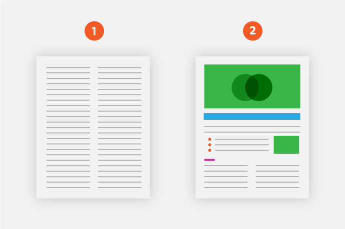 If you are the 14 out of 15 users who locate specific pieces of information only when scannably placed on a page, then #2 is the grand champion by far. Put simply, skimmers are the new readers.
How to structure for skimmers to get your main points across
People visit websites to gather information quickly, according to Nielsen. As a result, structure your content to guide skimmers’ eyes to the parts of the page that are relevant to them. The best ways to do this…
Create headings and subheadings that tell the whole story
The ConversionXL blog is chock full of headings and subheadings structured-for-skimmers. Check out these two: 
 The above examples are the perfect mix of descriptive, actionable, and juicy. With this intentional formatting, skimmers take away the main ideas from the post without having to read the whole article.
Break down your articles with a table of contents
Alex Cowan turns the efficiency of subheads up a notch - or 10 - by adding a table of contents at the very beginning of the post. 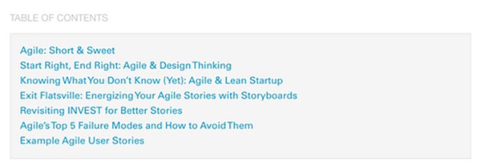 After clicking, the page rapidly scrolls to the section the reader is looking for. This strategy works best for long-form articles that dive deep into a topic. In addition to the above tactics, follow these other tips to effectively structure for skimmers:
- Use bullet points lists to break up the text (like I just did here!)
- Use images, charts, and graphics to visually communicate your ideas
- Highlight keywords with bolding, hyperlinking, underlining, or italicizing
- Write short sentences and paragraphs. Basecamp CEO Jason Fried said it perfectly: “Short paragraphs get read, long paragraphs get skimmed, really long paragraphs get skipped.”
Skimmers may be the new readers, but the sponges of the world are still alive and well.
Sponges read every word
Sponges soak up every detail from your online properties, and are typically your company’s raving fans who you’ve won over time with remarkable content. For the skeptics, who believe the Buzzfeed-ification of the Internet has killed any of the remaining sponges out there, we’ve got some stats to tell you that millions of sponges still exist, yes, in 2015.  Fast Company journalist Michael Grothaus, recently covered a rapidly growing site called Wait But Why, an online publication that writes long-form articles for the sponges out there - including influential sponges like Elon Musk. Just 19 month after the site began, Wait But Why now has numbers any startup blog would be envious of:
- 31 million unique visitors total
- 87 million pageviews total
- 1.6 million unique visitors per month
- 4.6 million pageviews a month
- 106,000 newsletter subscribers
The site is visited by people from every country in the world every month, and its content is so viral readers offer to translate it into other languages, including Chinese, so their non-English-speaking friends can read it.” The takeaway: there’s still sponges out there craving in-depth content.
How to write great content for sponges
So how can you win over sponges like Wait But Why and Neil Patel do? Here’s three ways: 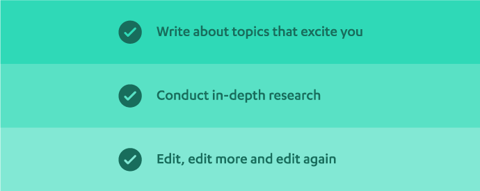
Write about topics that excite you
According to Grothaus, when Wait But Why co-founders write a post “it’s something they’ve probably talked about for 50 or 100 hours.” Instead of creating content that merely scratches the surface, focus on topics you can dive a mile deep into. Your insight, passion, and expertise will show through your words.
Conduct in-depth research
Research may include: interviews, links to trusted online resources and/or your own studies and research or surveys. Take good notes during this stage, they’ll come in handy when you start writing.
Edit, edit more and edit again
Put together a group of editors - friends, family, influencers, professional friends, etc - who will read your post before it goes live. Up next is the final type of web reader - socialites.
Socialites share your content (if there’s killer visuals)
According to Slate Writer Farhad Manjoo, when people land on a story, they very rarely make it all the way down the page. A lot of people don’t even make it halfway. “[The] data suggests that lots of people are tweeting out links to articles they haven’t fully read. If you see someone recommending a story online, you shouldn’t assume that he has read the thing he’s sharing,” Manjoo said. We call these readers socialites - people who are quick to share an article…if the imagery rocks.
How to decorate for excited-to-share socialites
Blog Pros found that the optimal number of images per blog post is one image for every 350 words. So what are you supposed to “decorate” your next post with to naturally break up the text? And what images will entice socialites to share, share, share?
Get inspired with these examples
Before we share our curated list of free design tools, check out a few examples of blog posts that are perfectly decorated for socialites… Buffer’s Instagram for Business: 12 Answers to the Biggest Questions About Timing, Hashtags, and More:  CoSchedule’s How To Make The Best Blog Graphics (For Non-Designers):
  Or check out FirstRound’s blog for more people-focused imagery:

Use easy-to-learn design tools
For those of you creating your own visuals, these design tools will speed up the process:
- Canva - “Amazingly simple graphic design software”
- Pablo - Buffer’s image creator
- Piktochart - “Create beautiful infographics in less than 10 minutes”
- Recite - “Create visual quotes as images”
Utilize free, non-cheesy image sites
Raise your hand, and repeat after me: “I will never use cheesy stock photos again.” To help, here’s a few of our favorite spots online to score royalty-free, high-quality images:
- Unsplash - “10 new photos every 10 days”
- Stockphotos.io - Currently has around 27,000 images.
- The Badass List of Free Stock Photos Websites for Designers - “All the stock photos you can eat.”
Your content, optimized
To recap, the three types of readers to keep in mind as you write for your emails, websites, and blog articles are:
- Skimmers: Create headlines and subheadings that get your main points across, and convey the gist of your message with a quick scan.
- Sponges: Write in-depth, quality content for people will devour every single word.
- Socialites: Design killer visuals to make your work irresistible to share.
By following the above tips you’ll optimize your content for the different types of web readers, leading to increased shares, higher web traffic, and an ever-growing stream of interested leads. How do you structure for skimmers, write for sponges, or decorate for socialites? What results have you seen from making your content more scannable? Let us know in the comments.


